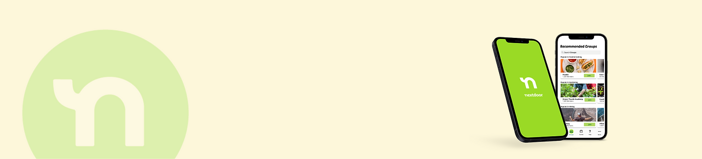
Nextdoor Redesign
General Mission
Improve an existing feature to better cater to older generations by analyzing heuristic violations and redesigning interactions.
Type
User Research
UX/UI Design
Prototyping
Contribution
UX Designer
UX Researcher
Methods
User Personas & Flows
User Interviews
Refining Iterations
Wireframing & Sketching
A/B testing
Overview
Over the course of 8 weeks, our team redesigned an existing feature on the Nextdoor app to better fit the needs of the Baby Boomer generation and their struggle with loneliness. Through preliminary heuristic evaluation and user interviews, we determined our goal for this redesign was to:
-
Make communication methods more personable and meaningful to combat lonliess in this age of technology
-
Redesign Nextdoor’s feature to be simplistic and easily digestible for easier navigation
-
Allow the Baby Boomer generation to feel more confident while using Nextdoor to make connections
How might we design a product that Baby Boomers would buy/use?

Approach to Our Design Process
Exploring the Problem Space
Who are the Baby Boomers?
The Baby Boomer generation consists of individuals born between the years, 1946 and 1964 (aged 57-75 as of 2021).
As we conducted our research, we learned that older users are often left out of design testing, leaving them with a greater learning curve as technology advances. Thus, we pivoted our scope and expanded our target demographic to users ages 57+ in order to make our redesign more inclusive and in line with our goal to alleviate feelings of loneliness amongst older individuals.
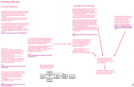
Literature Review + Competitive Analysis
As a team of “Gen-Zers” we really had no idea what’s it’s like to be in the shoes of our target demographic. We each took it upon ourselves to research common problems facing the Baby Boomer generation and how technology could potentially aid these issues. It’s through reading professionally backed studies and scholarly articles that we learned:
-
While technology has become widespread and integrated into our society, there is a lack of representation and accessibility for seniors.
-
The current market shows certain aspects of aging like safety and health have received more attention than needed and have thus kept the aging population stagnant towards technological competence.
-
Technology for seniors needs to be focused on engagement and enjoyability of product, not just basic tasks/health-related issues.
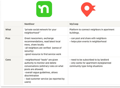
Competitive analysis comparing neighborhood-based social media
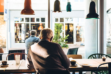
More social interaction and enjoyable experiences with technology have proven to improve one’s health & wellbeing.
Our goal for this redesign was to make digital interactions more accessible, approachable, and feel useful for older adults in forming and supporting these social interactions.
We felt that strengthening neighborly connections via in-person and digital interaction would best serve the senior demographic. After conducting a competitive analysis on the two known applications, MyCoop.com and Nextdoor. We found that Nextdoor has several features that could be improved upon to suit the needs of our users.
Designing a Solution
Heurisitic Evaluation of Existing User Flows

Exploring our problem space revealed that baby boomers often struggle with social isolation and a lack of confidence toward technology, making them suffer from increasing loneliness and boredom. With our goal in mind, we decided to improve upon an application that our Baby Boomers currently use: Nextdoor. We also dissected the current user flow of Nextdoor and any usability heuristic violations that we could possibly address in our redesign.
How might we make our design process more accessible to seniors?
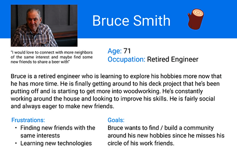
User Interviews and Persona Building
After deciding on the direction we wanted to go in for our redesign, we set out to meet with 7 users who are a part of the Baby Boomer demographic (ages 57+). The interviews were semi-structured so that we could get a better idea of their goals, frustrations, current user experience with mobile applications. We intentionally left our questions open-ended so that users could think out loud and share details on their day-to-day experiences with making and maintaining connections.
From those interviews, we were able to develop two personas that would help us center our design around our user’s needs and pain points. Referencing these personas throughout the process let us have a stronger commitment to our user group and develop user-centered designs.

Solution Ideation
Our team framed our challenge as How Might We questions to better view them as opportunities for creative design. Each team member then took 8 minutes to sketch out 8 possible solutions for our prototype. Performing these exercises gave us a better framework for our design and overall focus of the prototype.

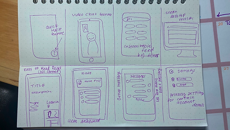
My "Quick 8" sketches
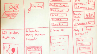
(In order) Sketches done by Brandon, Evan, and Maggie
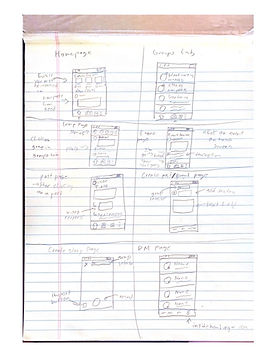
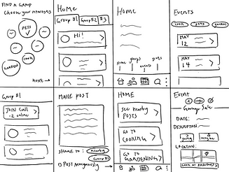
1st Iteration: High Fidelity Prototype + Testing
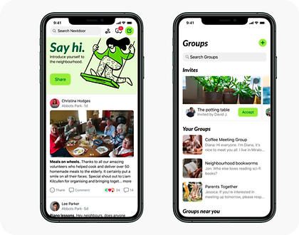
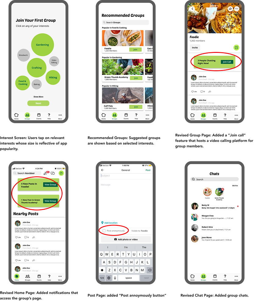
After discussing our various ideas and confirming our design requirements, we developed an interactive prototype on Figma to better explore user interactions when testing. Our prototype refined Nextdoor’s Group feature by showing recommendations based on selected interests and implementing a video call feature, a group chat feature, anonymity options, and better group accessibility from the Home screen.
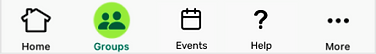
Our evaluation of Nextdoor's usability heuristics revealed that its current navigation bar makes it unintuitive to get help and look for local events, two functionalities that could be useful for our targeted user group. Because of this, we incorporated a new navigation bar that prioritized those functions to improve accessibility. Although they are not interactive within our prototype, they would link to the Events and Help pages that are already implemented by Nextdoor.
Nextdoor's current navigation

Our adjusted design
User Testing
We used moderated, remote interviews with two different users through Zoom. These users shared their screens as they navigated through the Figma prototype while one interviewer asked them questions and the other group members took qualitative notes on the scenarios tested.
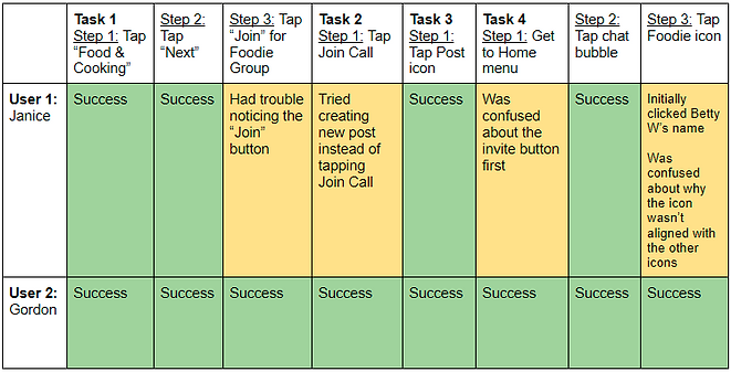
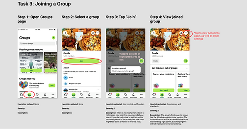
Task Table: Important takeaways as users navigated through the task prompts, with color corresponding with the severity of the problem. Task 1) Join a group through selected interests. Task 2) Talk to the people within a group. Task 3) Make a post within a group. Task 4) Send a text message to the Foodie’s group chat.
2nd Iteration: Prototype Refinement/Final Notes
Addressing Pain Points
For the next iteration, we wanted to improve our prototype to address some pain points identified during the user interviews. A big enhancement was increasing its interactivity, like being able to tap on more buttons and swipe through suggested groups, which improves the overall user experience for future iterations. We also slightly adjusted the "Join" button for a greater impact, but decided to keep the colors to retain consistency with the branding.
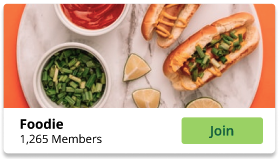
Iteration 1 "Join" Button
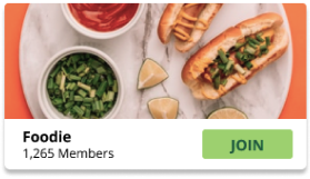
Iteration 2 "JOIN" Button

Another adjustment was changing the placement of the Groups’ icons on the Chat page using the right alignment so it can be more consistent with users' mental maps. We kept the Pinned Chats feature but added a title so users are more aware of the functionality and aligned the icons with the messages below to improve consistency.
Conducting virtual interviews served the purpose that we needed, but having more interviewees could have helped us gain more diverse responses to our prototype. Laying out our prototype’s limitations would have also been nice since the users attempted to interact with static components, causing unnecessary confusion during testing.
Prototype in Figma
(Best viewed on desktop)
Outcomes and Lessons
Learning to use research and user interviews to drive a project to completion
We affirm that we developed an accessible and approachable version of the Nextdoor app that baby boomers can efficiently use. Our new features make Nextdoor more personable and create intimate interactions that baby boomers often struggle with.
Our design performed very well with our users, as they believed that it was a successful, well-laid-out improvement. An app that connects the neighborhood should be approachable to everyone, and we believe that’s what we’ve done.
Considering how our design is a rework of a current application, we were able to integrate our features with Nextdoor’s style seamlessly. Looking back, we wish we could have created a fully interactive prototype that behaved like the app, but we believe our design conveyed a significant amount to address our problem statement and assist baby boomers’ experience with technological socialization.
Takeaways
Design is all about empathy
There is no such thing as a “perfect” design solution because you always have to take in new insights and iterate through your work. While tedious and frustrating at times, this cyclical process is crucial to creating more accessible and effective designs that evolve with the times. Design is all about embracing the process.
Through intentional research and iterations, I learned a lot about how to design for elderly users and it was rewarding to see our solutions be well received by real users. With technology advancing at such a rapid rate, it’s important to take a step back and consider all the different people that get left behind in the name of progress. Digging into this case study has made me wonder about what other demographics of people are not being represented in modern design practices and in what ways can we ensure that they are adequately included?